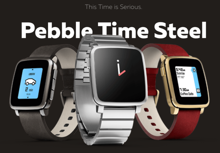
I’ve been wearing a Pebble Time watch for the past 60 days (day & night), only taking it off to shower, and I have to say, it’s a solid wearable device. Having been a long time Apple Watch user (been wearing an Apple Watch since it was first released) and also having used a majority of the fitness bands on the market, I wanted to see how the Pebble compared.
The quick of it is: the Pebble easily blows away the basic fitness trackers like FitBit and the MisFit 2 in terms of features, usability, & design. That’s pretty obvious because the Pebble is a quality, full-featured wearable watch. But more surprising, the Pebble holds its own against my Apple Watch, especially when it comes to the core features a smart watch needs to really do well. And in some cases, like Pebble’s incredible battery life and price, it bests Apple’s much more expensive watch.
Watch Design
Overall, I like the Pebble’s design. I think it looks better on my wrist than my Apple Watch. There’s a sleekness to it but its design also makes it look more like a watch than a mini-computer strapped to my wrist. It isn’t too flashy and with the frame & interchangeable watch bands, it goes well with my wardrobe no matter what I choose to wear. I did notice that using a thicker / wider band helped make the watch look more cohesive on my wrist. (thinner bands made the watch itself look oversized & too large on my wrist). Luckily, there are tons of affordable bands for the Pebble.
Build Quality
The Pebble feels more rugged and solid, less like a miniature iPad on your wrist. Sort of like the difference between a case-less iPhone and a Nintendo DS (if that makes any sense). I never felt worried about banging it into a wall on accident like I do with my Apple Watch. The components feel well made and everything adheres without seams giving you piece of mind in the water or a dusty place. That being said, I did find that the Pebble’s screen seemed to get micro scratches often dulling the smooth look after several days of use (most noticeable in direct sunlight and hardly detectable otherwise).
Screen
Speaking of direct sunlight, the Pebble’s eInk display really comes alive in direct sunlight. Whereas the Apple Watch’s screen is unreadable in bright light (the Apple Watch series 2 is better but still not as good in direct sun as the Pebble). But the Pebble is less impressive in very dim light. Because the screen doesn’t provide touch and the raise wrist to turn on feature requires a massive flick of the wrist to activate, I found it hard to see the time without having to fumble for a button press with my other hand. The main issue I ran into was that the “raise wrist to show backlight” feature is difficult to trigger. Whenever you raise your wrist to look at your Pebble, the backlight is supposed to turn on but I found that I had to flick my wrist up, almost violently to trigger this action (sometimes multiple tries). After a while, I just gave up on that and instead used my free hand to tap one of the buttons on the Pebble to get the screen to show the backlight. I hope this will be improved in the next version. Still, the Pebble’s backlit display looks good in the dark and illuminates more than enough to use the device comfortably.
Wearable feel / weight / long term wear
I hardly noticed the Pebble on my wrist. It’s a comfortable device. Even more impressive, while wearing it at night for sleep tracking, I was never bothered or frankly even noticed it. It seems maybe a bit heavier than expected when you first hold the watch in your hand but as soon as it’s on your wrist, you hardly notice it.
Wrist strap
While I like Apple’s clever custom mechanism to attach wrist straps to their watches, the Pebble has a unique advantage here because it works with nearly every existing wrist strap on the market. Instead of using a proprietary wrist strap like Apple, Pebble just works with the standard watch straps you can find anywhere, giving you many more options. They are harder to take on & off but the additional choices and cost savings are a nice benefit.
Waterproofing
This was a big selling point for me. The Pebble can be showered with, fully submerged, and you can even swim with it. Apple has come out with a similar feature in it’s Apple Watch series 2. I used Pebble to track my swims as at a local pool, doing laps with both crawl and breast strokes. I found the swim tracking to be adequate but not overly impressive. The problem is that the Pebble can’t do much more than track some wrist movement and elapsed time, basically causing it to guess on number of calories burned and distance. I found it to be off by as much as a few pool lengths after a swim session. That might be okay in some cases but the additional problem for me is that the Pebble does not currently have a built-in Swimming app and no health kit integration so even if you do track your swims, they won’t be logged on your iPhone. Word is that several third parties are working on swim apps with health kit integration so this should get better over time. So basically, the Pebble has awesome waterproofing and a somewhat disappointing swim tracking experience.
Input: Buttons vs Touch Screen
I was a bit hesitant going from a touch screen (like I’m so used to with my iPhone) to a button-only interface but I found the Pebble to be easy to use and actually, the buttons have some unexpected benefits. One of the most useful is that you don’t need to look at your Pebble to interact with it. This comes in handy when you’re in the middle of a meeting and your wrist starts getting tapped that you are receiving a phone call. A simple quick press of the side button silences the call. With a touch screen phone or watch, you’re forced to look at the device while tapping around to silence a call. There is a way to silence your Apple Watch by just putting your palm over it but still, the Pebble’s buttons seemed easier for this type of action. That being said, when using an app on the Pebble, I did find the buttons sometimes cumbersome to use compared a touch screen so there’s pluses & minuses to both.
Battery Life
The Pebble’s battery life blows away all the other major smart watches on the market. I found my Pebble got almost a full week of battery on a single charge with heavy daily usage. The Apple Watch barely gets a day under heavy usage and if you do a long workout like a hike, you’ll be lucky to get more than 4 hours. That made the Pebble viable for all kinds of activities as well as sleep tracking and I found myself wearing it more often because it was spending less time on the charger.
User Interface
I like the Pebble’s playful user interface with smiling sunshines and upbeat graphics. It’s fun and interactive. On the other side of the coin, I seemed to get lost in the menus often and had trouble getting to apps as quickly as I hoped. Still, for a non-touch screen device, the overall user interface is well thought-out and pleasant to use in most cases.
Haptic Feedback
The tap you receive when a new notification arrives is comfortable, not too hard or soft, and noticeable but not annoying. I feel like this is as good a haptic engine as any other smart watch I’ve tried and worked well in every case.
Time keeping & Watch faces
The clock on my Pebble was always accurate to the second. That’s pretty much a basic must-have in a watch but I’ve found several time-keeping devices in the past to be off by as much as a few minutes over time. But what’s really great about the Pebble is the hundreds of watch faces offered by both the company and third parties. There’s a Pebble watch face store where you can browse hundreds of designs with all kinds of helpful complications & interesting themes/colors. Pebble blows away any other smart watch when it comes to their watch face store. It’s one of the highlights of the device.
Settings Menu
I didn’t love the way the Pebble organized its settings. I think I’m in the minority here though because many people I’ve talked to and reviewers online seem to be obsessed with the idea of being able to control all the watch settings from the device itself. I see the point here and the idea behind it but in practice, I like Apple’s approach better of controlling a majority of things from your much larger and more practical phone screen. To me, it was a hassle to click around 5 levels deep into settings to get to something and I had trouble getting an overall picture of all the things the Pebble could do because I kept getting lost in the depth of the settings & options. So your mileage may vary on this. If you like the idea of being able to do everything from the watch itself, Pebble has you covered.
Fitness
It seems like all smart phone manufacturers are increasingly narrowing their focus to fitness tracking. It’s now the key marketing point for both the Pebble & Apple Watch. I think it is likely due to feedback from the smart watch early adopters who found the biggest value & most staying power from devices that helped them get fit / healthy faster & easier. Pebble’s fitness tracking features are solid and with the next release of the Pebble later this year, you’ll see that focus tighten with key features like heart rate monitoring & more health sensors.
Activity Tracking & Step counting
At the heart of most fitness devices is activity tracking. How much movement did you get in a day? How many calories did you burn? How many steps did you walk/run? These types of automatic metrics are the basis for seeing an overall activity picture of your health on a daily basis and Pebble does a good job of capturing them without you having to interact with the device at all. One place where the Pebble wasn’t as accurate though was in step counting. Because the Pebble only uses the swing of your wrist to track steps, any unnatural motion could cause missed step counts. I did several tests with the Apple Watch and then with the Pebble, same paces, same distance, same time of day, same wrist movement and the Pebble continually over-counted my steps by about 10%. I found the FitBit and Misfit to also over count steps while the Apple Watch either was accurate or under-counted steps. The differences were not drastic enough to be alarmed by but I still wished the accuracy was better. This may be improved in the upcoming Pebble out later this year.
Apple Health Kit / Activity integration
As an iPhone user, I really loved that Pebble synchronizes with my Apple Health app & activity. I saw step counts, calories burned, and daily activity rates sync’d automatically to my overall health data, letting me use Apple’s built-in reports to analyze my health statistics. The integration is reliable and seamless.
Sleep tracking
I was impressed by the sleep tracking in my Pebble. This is something my Apple Watch has never been able to do (both because of short battery life and also because there is no built-in sleep tracking function on the Apple Watch). The Pebble consistently captured my sleep cycles within 10 minutes or less of the actual times I feel asleep and woke up. Best of all, there was nothing I needed to do. I just wore my Pebble to bed and in the morning, the Pebble app showed my sleep for that night in a convenient and easy-to-use graph.
Heart rate monitoring
The Pebble currently has no heart rate monitoring but the new version coming out later this year will introduce this feature. Early reviews have said the heart rate monitoring is really solid in the upcoming device so I expect this feature to catch up with some of the other devices already on the market.
Pebble app
The Pebble app is useful and reliable. There’s basically three main parts: 1) Home screen. 2) Watch face & app store. 3) Basic settings & notifications. The home screen shows you graphs about your sleep, activity, and other helpful info. The watch face & app store lets you get new looks for your watch and download helpful apps to use on your Pebble. And the settings section lets you set up some basic configurations as well as determine how notifications will work between your phone and your Pebble. The app is well laid-out, intuitive, and the health info is especially insightful.
Phone integration
Even though Apple has a very closed system in terms of what a wearable can do with the iPhone, I was pleasantly surprised at how well the Pebble functioned with my iPhone. Android phones offer a lot more customization & integration points so the Pebble is even better with those types of phones but it was solid on an iPhone. The Pebble’s iPhone integration was never going to be as tight as the Apple Watch of course because Apple built specific integrations between those devices that Pebble does not have access to. That being said, the Pebble is a good device for iPhones. And on Androids, it’s even better.
Phone calls
Once the Pebble is paired to your phone, it basically acts as a notification extension for many of the things you do on your phone. The Pebble doesn’t actually have its own cellular connection, instead it uses bluetooth to pair with your phone and piggyback on your phone’s connection. So when you get a phone call, not only does your phone ring but (as long as your Pebble is within a close range of your phone) your Pebble will also tap your wrist and display the caller ID information. This worked reliably in every case I tested. The Pebble doesn’t have a microphone or speaker so there’s not a way to answer the call from your Pebble but for just notifying you of an incoming call, it works well.
SMS & Other Notifications
Getting notifications on your Pebble works the same as getting a phone call notification. The Pebble’s screen changes to show the notification information and allows you to scroll through the entire message. For example, when you receive a text message on your phone, the Pebble will display the person that sent the message and the message text. You can then use the side buttons to scroll up or down to see the entire text. Although the notifications were reliable and worked just fine, I didn’t love that because of the way the Pebble displayed an SMS (emails have the same issue), most of the message was off the screen and required scrolling. I found that I could only see maybe the first 4 or 5 words of a message before I had to do more scrolling to read it. In addition, when notifications come, they stay on the Pebble, covering the time display and all other details. This is great if you happen to be able to look at your wrist right away when the notification arrives but it’s kind of annoying if you were too busy to look at the time and then maybe an hour later, you want to check the time. You raise your wrist to look at the clock only to find an hour old message still covering your screen and you have to use the side buttons to dismiss it. Despite these annoyances, the notifications themselves and the wrist tapping worked well.
Calendar
The calendar integration with your phone’s calendar was reliable and worked well. You can see your next appointment clearly displayed on the Pebble and you can use the scroll buttons on the side to jump forward in your day to see upcoming future appointments. Meeting notifications were reliable and the tapping felt natural. It’s a small thing but I also liked that Pebble automatically told me when sunrise and sunset were happening for a day. That came in handy several times. Calendar integration on the Pebble is very good.
Camera & Photos
There’s not much to say here right now (although this will probably change in the future). Currently there’s not a way to view photos on the watch but through third-party apps such as Triggertrap, you can remotely take a picture using your watch as the button for your phone’s camera.
Cardless Payments
I only mention this category because the Apple Watch and a few Android watches can let you pay with your wrist. This isn’t possible with the Pebble out of the box currently but there are several “smart straps” coming in the future that will enable this NFC type payment functionality.
Price
The Pebble’s starting price of $99 is significantly cheaper than the Apple Watch’s entry level pricing of $269. The new Pebble coming out at the end of the year can be ordered for just $129 compared to Apple’s newest Series 2 watch which is currently available at a $369 starting price.
Bottom Line
If you are an Android phone user, the Pebble is the right choice for a smart watch. If you’re an iPhone user, it somewhat depends. If price is no object, then the Apple watch provides some better integration & features (although much worse battery life) but if spending almost $400 on a smart watch seems outrageous (or only being able to go a maximum of a single day on a battery charge), then the Pebble is by far, the best smart watch in the affordable category. Either way, the Pebble is fun to use, reliable, and stylish with amazing battery life and a very reasonable price.


